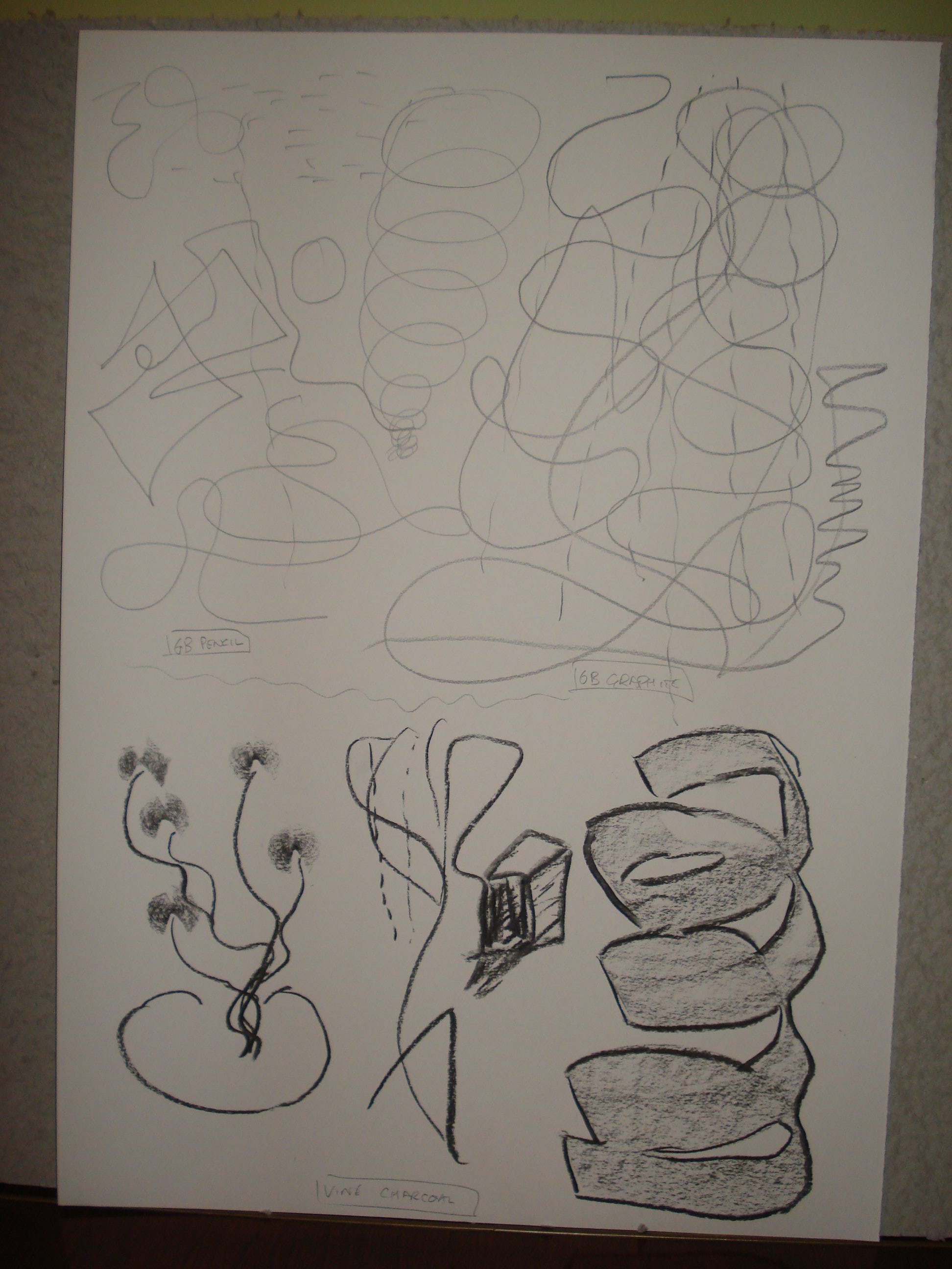
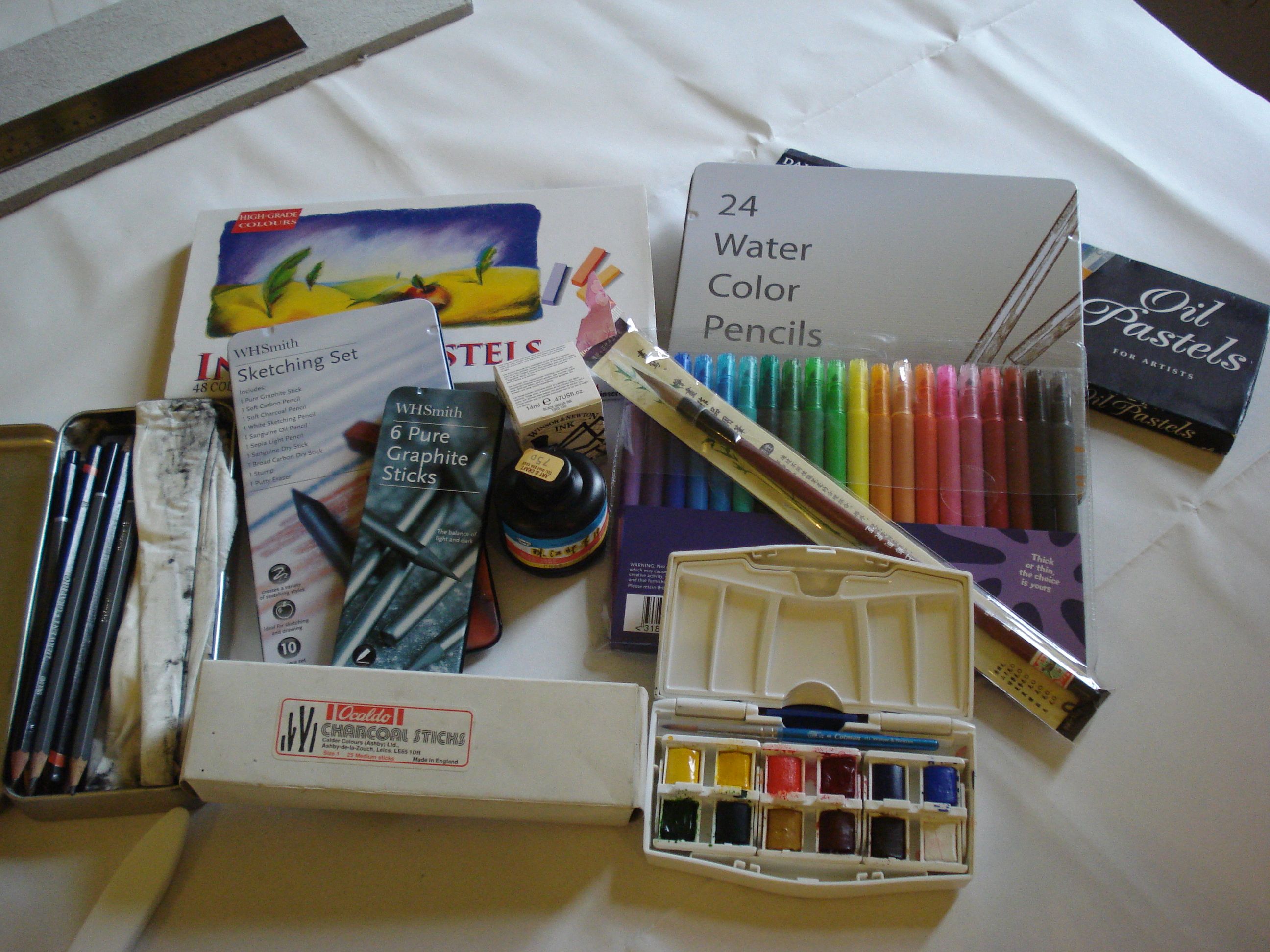
Hmmm. Interesting. I don’t doodle normally and so approached this exercise not knowing how I was going to do it or where I was going to end up. I made a couple of choices. Firstly I was only going to work in black on white paper. Even in media where I had colour options – felt pens, pencils, pastels, I chose to stick to the single colour. Secondly I decided to do most of the work on A2 sheets. This followed on from the first exercise where I found my gestures and mark making was more free when given a larger surface to work with.
Once I started just letting the marks happen, and just went with whatever they were suggesting, I found it quite a liberating experience and a lot easier than I thought it would be.
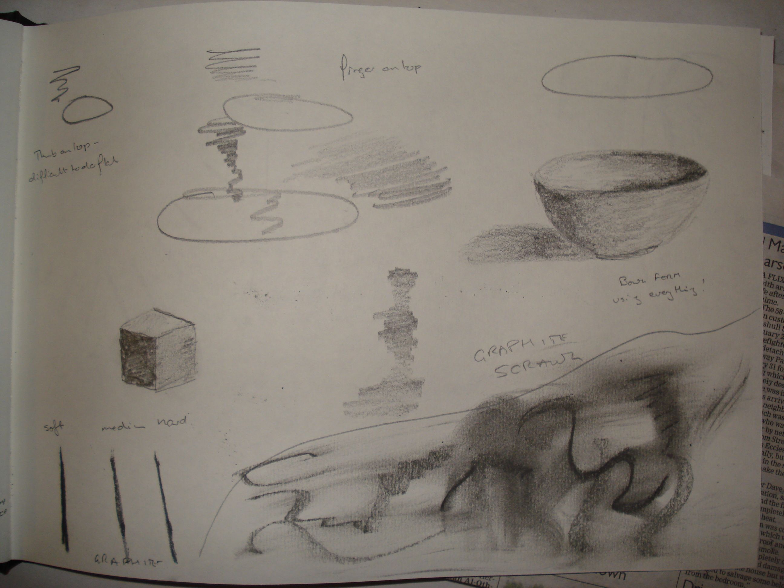
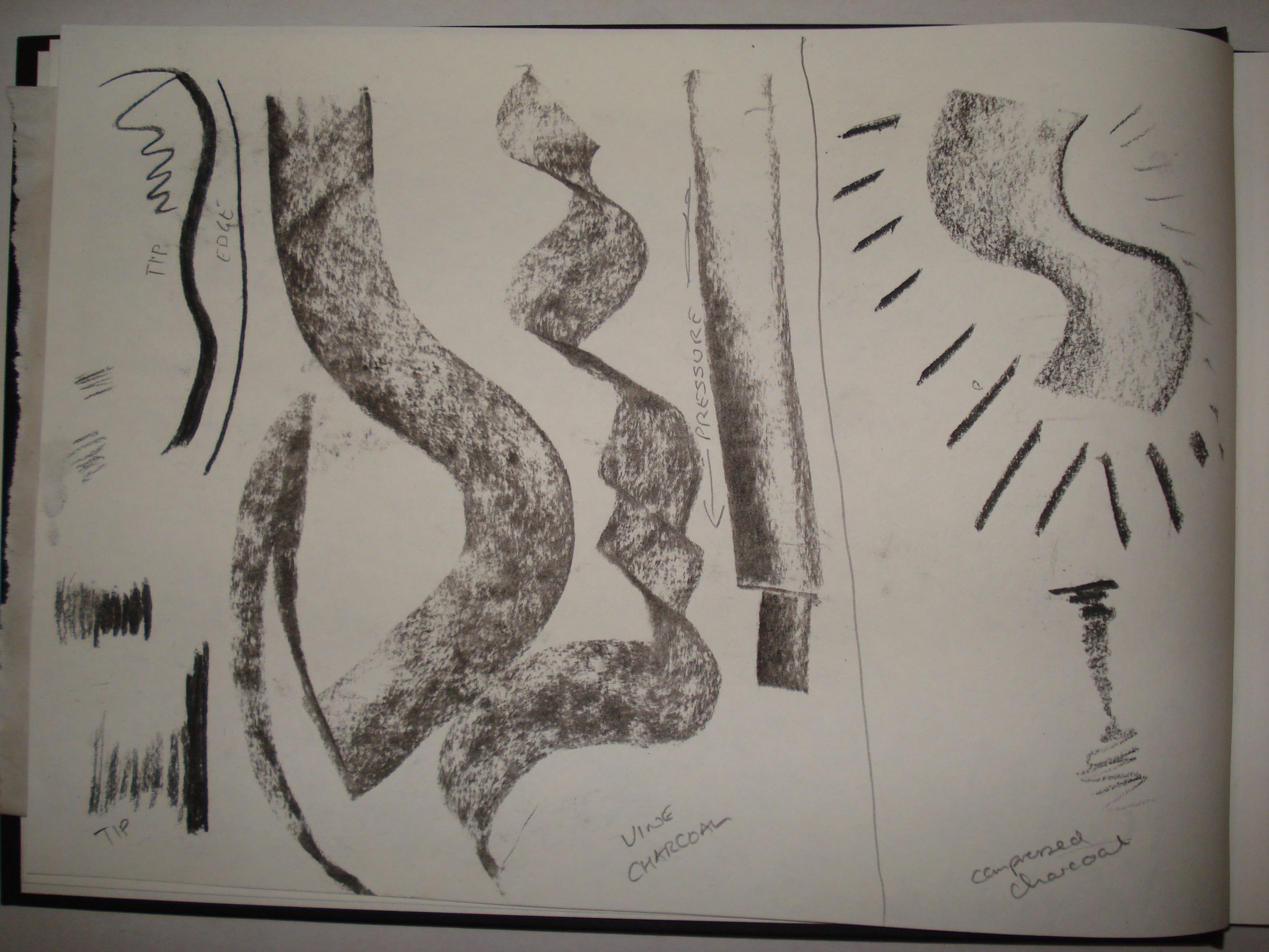
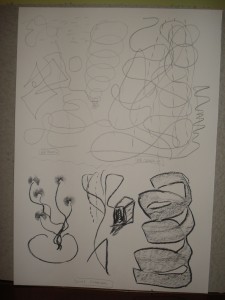
When working with just a thin line – pencil, graphite – nothing much seemed to happen. Squiggles, no inclination to follow a particular shape to develop it into something. When I switched to charcoal, using it on it’s edge, the Bow-tie type shapes I had made turned into flowers without really thinking about it. I like the ribbon form – again charcoal on i’s side, but the extra emphasis obtained by going around the edges with a strong line makes this a very interesting form.
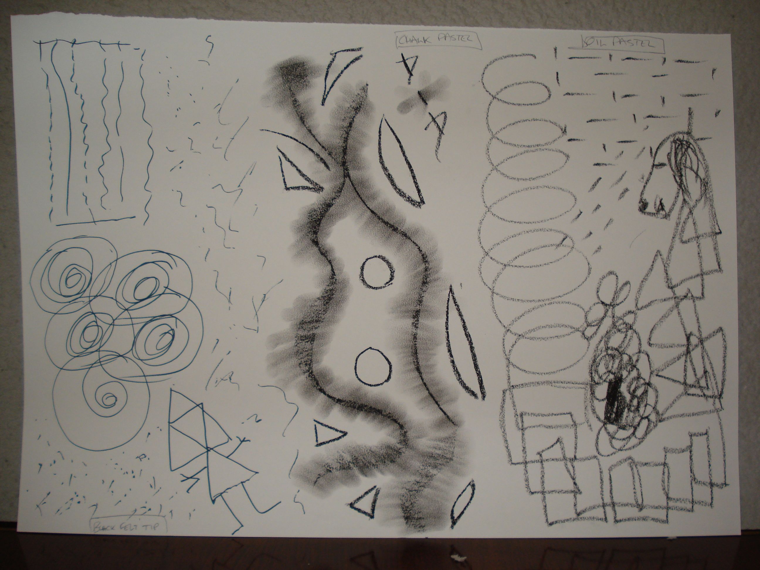
I’d started off with a portrait sheet so then swapped to landscape. The felt pen doodles took on suggestive shapes quite easily – perhaps a set of net curtains or prison bars at the top, perhaps a bunch of roses viewed from above below. Having worked with lines and circles/spirals, I went with triangles and ended up with an ‘origami” girl! The stuff in the middle is chalk pastel which I smudged out with my fingers. Surrounding these linear forms with simple geometric shapes added balance to a “composition”. I really like this. The oil pastels… I’m not sure about. It’s not a medium that feels “right” to me. I’m not sure if it’s the waxiness or the fact that even lines (as opposed to shading) seems to pick up the texture of the table underneath the paper, even though there’s a tablecloth. One shape did morph into a cartoon dog, though!
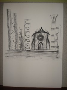
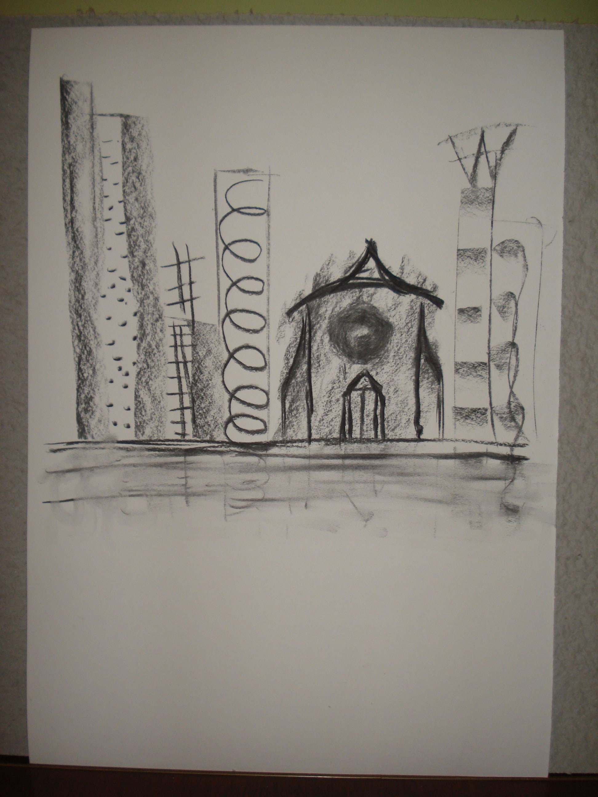
I then started thinking about buildings. Thinking of skyscrapers, I went with portrait paper, long lines with supporting horizontals. Thinking of New York, the grey splodge in the middle was originally a patch of grass in my mind, but then I started putting a lid on it, thinking of St Paul’s in London. The circle came next – originally a random shape, but then reminded me of Rose windows of medieval cathedrals and having recently been reading Gombrich’s History of Art I added a portico and then some fanciful flying buttresses. I didn’t feel drawn to put anything below the nominal ground surface below the buildings, but again going with thoughts of New York I put in a shoreline with some hints of reflections in some water. OK this went a little beyond the brief, but it did start from doodles and I followed it to its conclusion. I’m actually really happy with this!
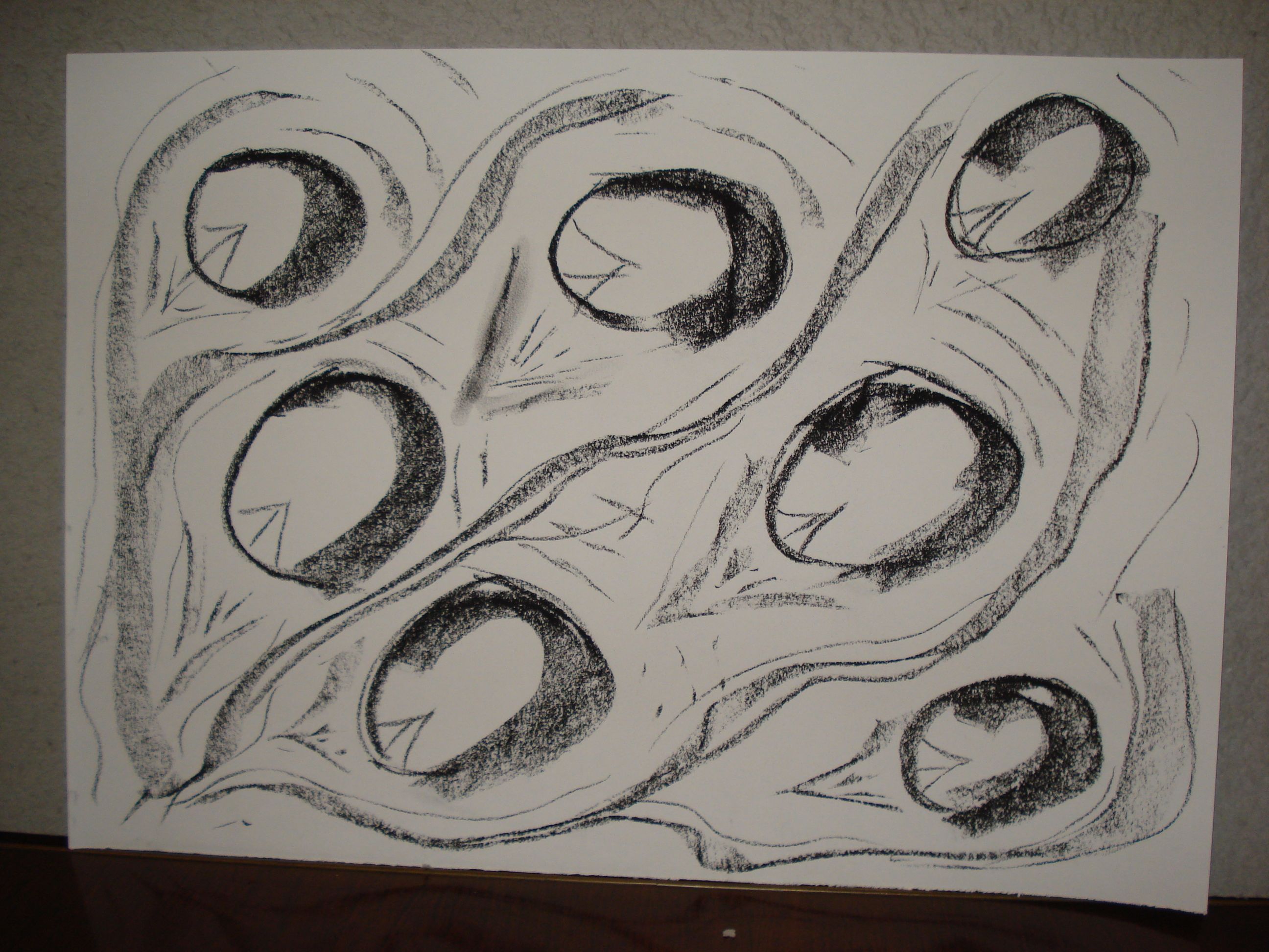
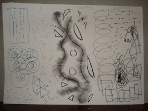
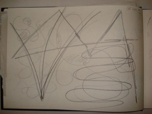
So onto thinking about water and a shift back to landscape format. I tried to go with rounder, curving flowing forms. Starting with the round forms, they became reminiscent of stones in a river and I tried following that train of thought, but I don’t think it was very successful.
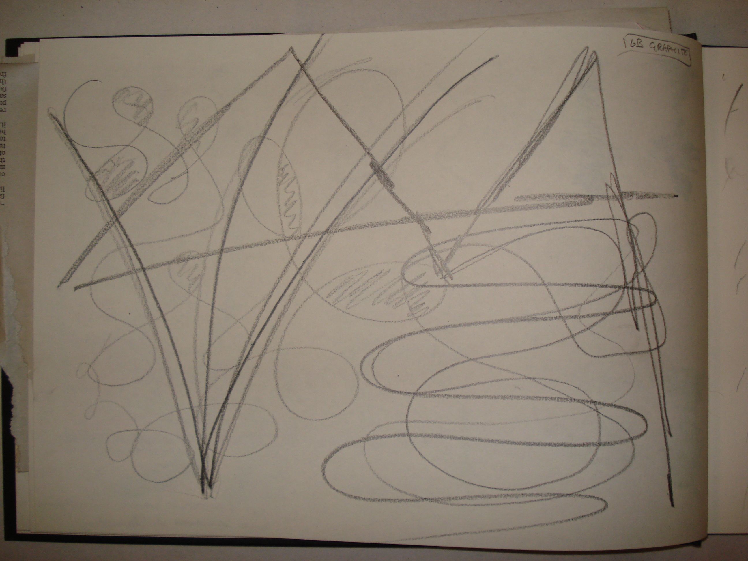
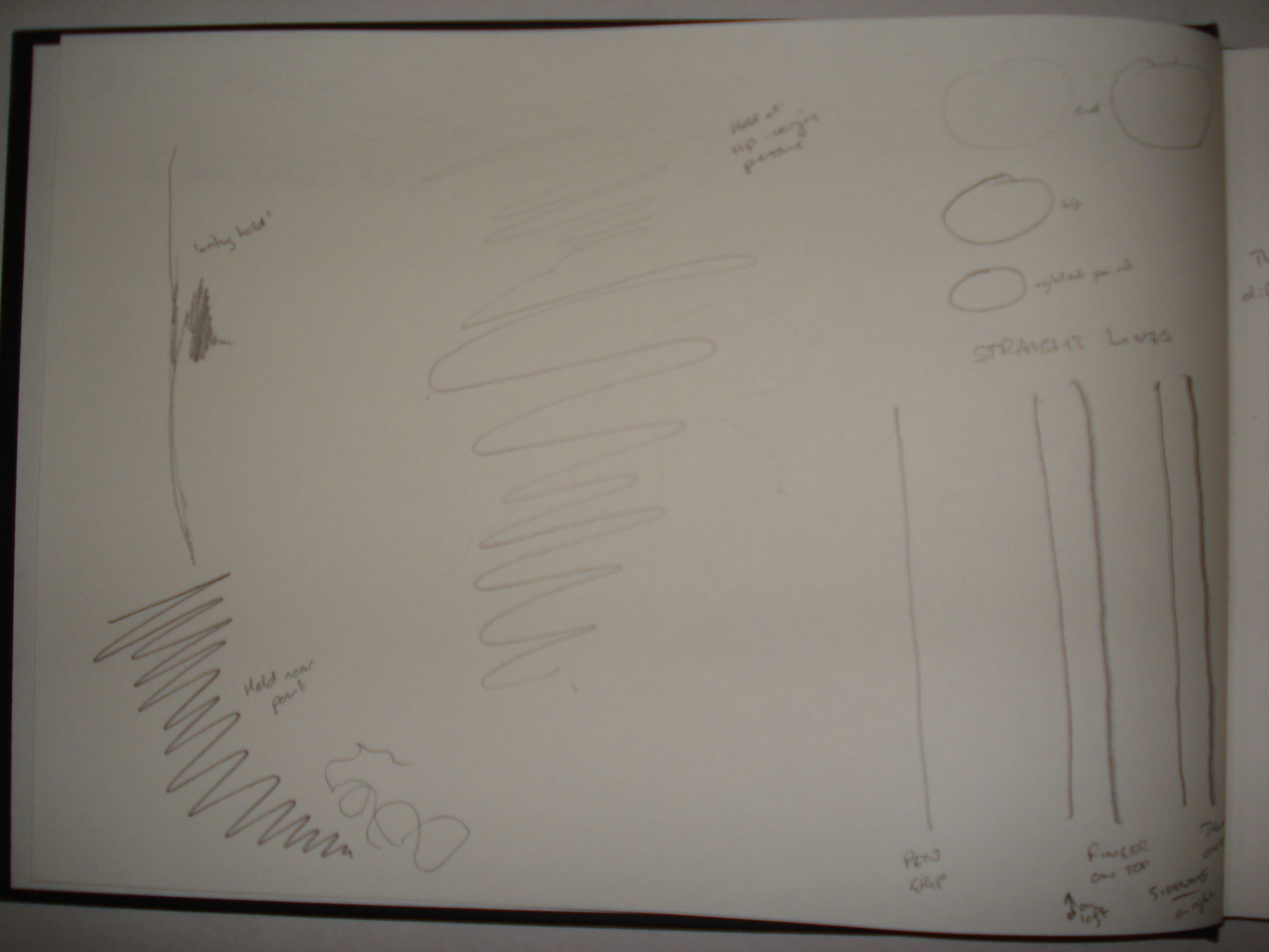
Just to prove a point I did a couple of pages in my sketchbook to deliberately restrict the movements I could make. Of the first page I was still thinking about water and flowing lines, but stronger straight lines took over and you can kindof see a landscape in there.
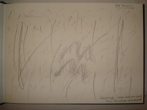
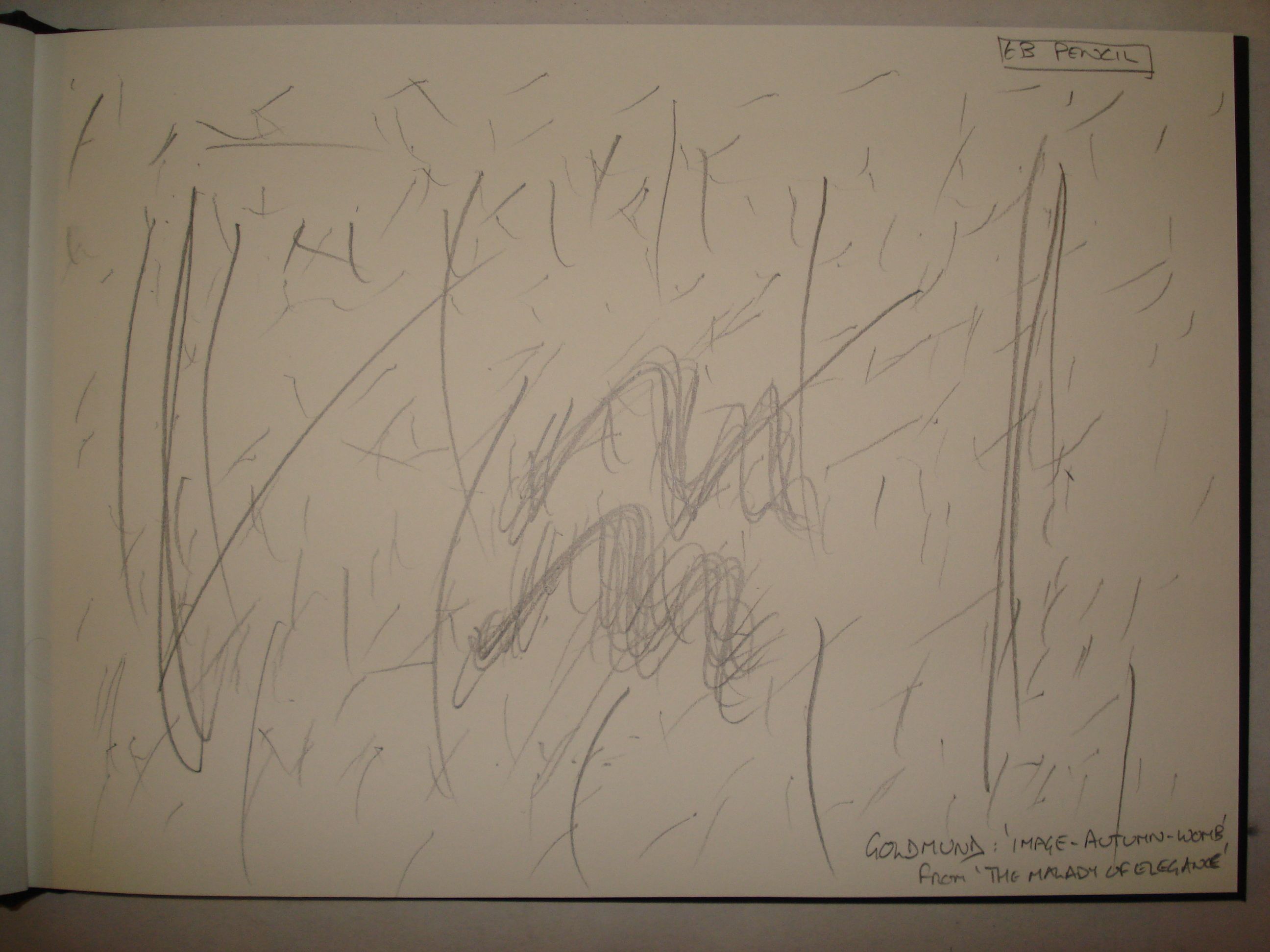
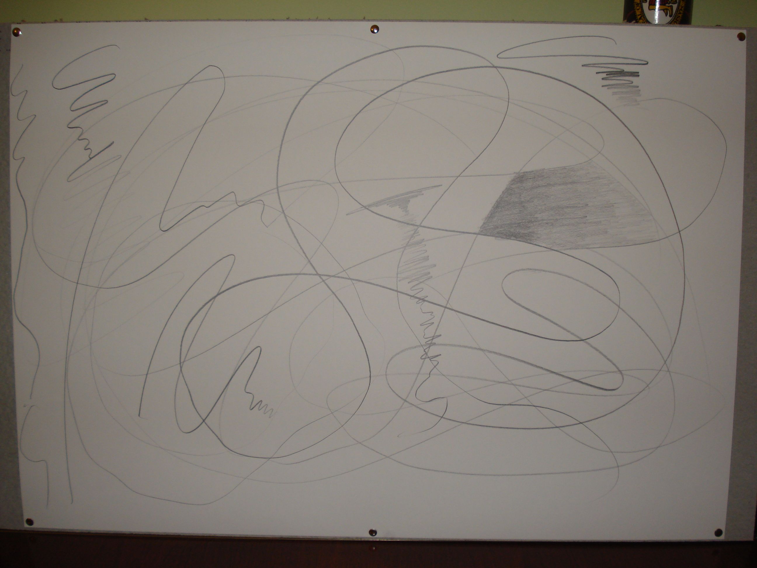
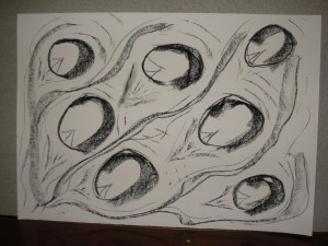
Starting the last page co-incided with the start of a new album on iTunes. I found myself following the staccato notes of the piano with my pencil drawing lost and lots of dashes. I kept going for the whole track, putting stronger lines in where I felt stronger phrases in the piece and wiggles where there were turns of notes. Placement of the marks started out random, but as the piece progressed I became more deliberate in their placement to try and create some sort of balance.
I got a lot more out of this than I thought I would, and have one thing – the skyline – which I really like. I’m not sure if I’d chose to use this method as the basis for starting a “work” but it’s a good exercise.
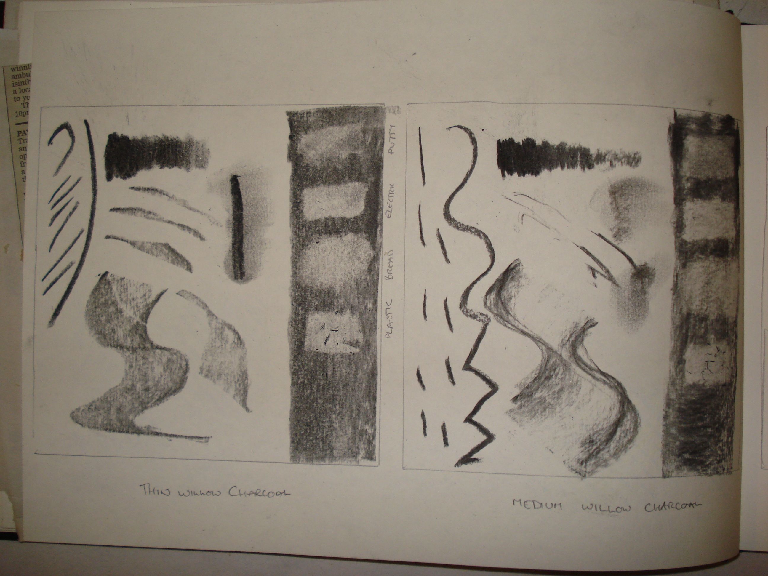
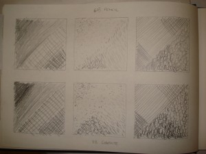
 I’m not a fan of putty erasers, they never seem to get back to the white of the paper. I guess they could be useful for taking a dark shading back to a lighter shade, still darker than the paper surface, but I’m not yet used to thinking in terms of “subtracting out” as a general technique rather than as a specific exercise.
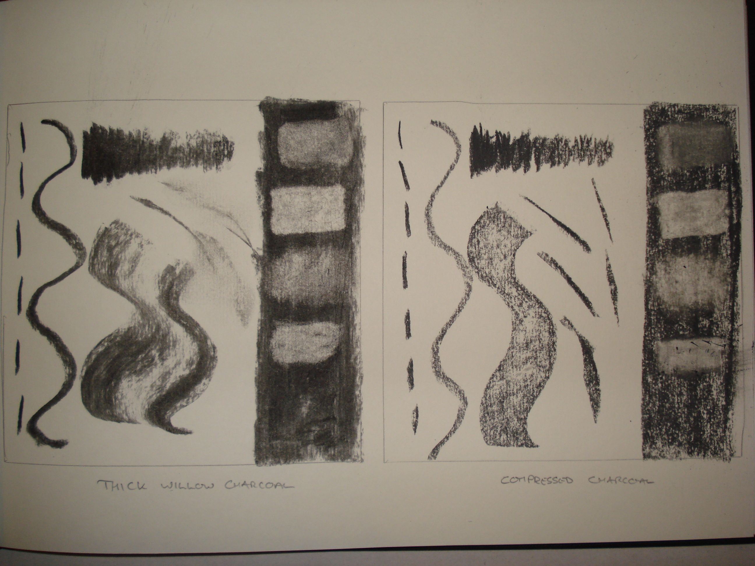